I’ve just installed DietPi for the first time and am having serious problems with the default colour scheme(s) used when SSHing via PuTTY.
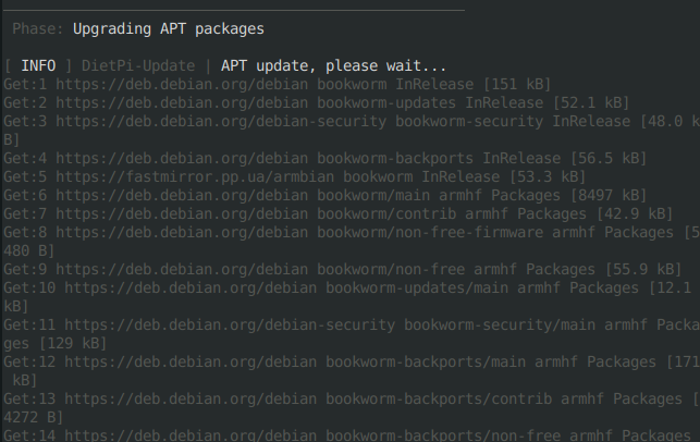
Eg, if I run dietpi-update, the screen of INFO and other stuff is basically illegible, because the text is a very pale grey on a black background. I’ve uploaded a screenshot to https://i.imgur.com/P1zWrfQ.jpeg
I have tried altering the colour settings in PuTTY’s “Change Settings…” > “Window” > “Colours” dialog in every way I can think of, but nothing works in such a way as to work for all of DietPi — a setting that makes one aspect legible, renders another unusable.
For example, unticking “Allow terminal to specify ANSI colours” makes the terminal essentially monochrome, which is fine for dietpi-update, but it makes running dietpi-software (which uses a “menu” dialog) impossible, as I can’t see what menu item is selected, because it uses an ANSI colour (red) to highlight things.
I have tried leaving “Allow terminal to specify ANSI colours” ticked and individually modifying some or all of the colours in the “Adjust precise colours PuTTY displays”, but that also doesn’t work, as the pale grey used in the output of dietpi-update doesn’t seem to be one of them.
Any help, suggestions — or pointing out of anything really obvious that I’ve missed — welcomed.
(If nothing else, the colours that are apparently used by ‘default’ in DietPi don’t seem to be very ‘accessibility’ oriented. I don’t have particularly impaired eyesight, for my age, but many other potential users will have. Perhaps that’s an issue that could be addressed in future releases? There’s loads of useful info at Accessibility Requirements for People with Low Vision )
I agree the contrast is a little low, but you are, AFAIK, the first one who does a topic/issue about this, in all the years. I remember one case where with a certain terminal type, this grey was even darker, and then really not readable, but that was a pretty rare or even single case.
\e[90m is this dark grey. You could use \e[0m or just an empty string for the default white colour.
Ideally we would have a separate config file or a section in dietpi.txt where those colour codes are defined, which are then read and used by dietpi-globals and dietpi-banner and in case all other scripts which currently set their own colour codes. And perfect would be a customisation menu entry in dietpi-config where those can be changed/selected.
I had the same problem, but didn’t have the time to report it, as I didn’t thought it was a big problem since it only appeared when doing updates or changing some things to dietpi configs, which is quite rare in my case.
I also have very low contrast text with Terminator, which is a bit hard to read (although not impossible):